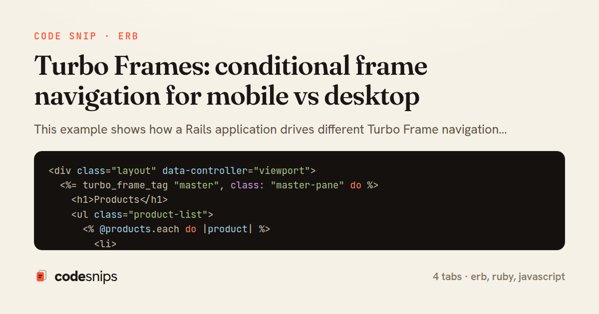
<div class="layout" data-controller="viewport">
  <%= turbo_frame_tag "master", class: "master-pane" do %>
    <h1>Products</h1>
    <ul class="product-list">
      <% @products.each do |product| %>
        <li>
          <%= link_to product.name,
                product_path(product),
                data: { turbo_frame: detail_frame } %>
        </li>
      <% end %>
    </ul>
  <% end %>

  <%# On desktop this panel is filled in place; on mobile it stays empty %>
  <%= turbo_frame_tag "detail", class: "detail-pane" do %>
    <p class="placeholder">Select a product to see details.</p>
  <% end %>
</div>
<%= turbo_frame_tag "detail", class: "detail-pane" do %>
<article class="product-detail">
<%= link_to "\u2190 Back", products_path,
class: "back-link",
data: { turbo_frame: "_top" } if mobile? %>
<h2><%= @product.name %></h2>
<p class="price"><%= number_to_currency @product.price %></p>
<div class="description"><%= @product.description %></div>
<%= button_to "Add to cart", cart_items_path(product_id: @product.id),
class: "btn-primary" %>
</article>
<% end %>module ApplicationHelper
# Desktop points detail links at the persistent side frame;
# mobile replaces the whole page via Turbo's special "_top" target.
def detail_frame
mobile? ? "_top" : "detail"
end
end
module ViewportConcern
extend ActiveSupport::Concern
included do
helper_method :mobile?
end
MOBILE_UA = /Android|iPhone|iPod|Mobile/i
def mobile?
return @mobile unless @mobile.nil?
@mobile =
case cookies[:viewport]
when "mobile" then true
when "desktop" then false
else request.user_agent.to_s.match?(MOBILE_UA)
end
end
endimport { Controller } from "@hotwired/stimulus"
const BREAKPOINT = 768
export default class extends Controller {
connect() {
this.current = this.category()
this.writeCookie(this.current)
this.onResize = this.debounce(this.check.bind(this), 200)
window.addEventListener("resize", this.onResize)
}
disconnect() {
window.removeEventListener("resize", this.onResize)
}
category() {
return window.innerWidth < BREAKPOINT ? "mobile" : "desktop"
}
check() {
const next = this.category()
if (next === this.current) return
this.current = next
this.writeCookie(next)
// Server rendering is authoritative, so re-fetch once the class flips.
window.location.reload()
}
writeCookie(value) {
document.cookie = `viewport=${value}; path=/; max-age=86400; SameSite=Lax`
}
debounce(fn, wait) {
let t
return (...args) => {
clearTimeout(t)
t = setTimeout(() => fn(...args), wait)
}
}
}This example shows how a Rails application drives different Turbo Frame navigation behaviour on mobile and desktop without duplicating templates or shipping two separate layouts. The core problem is that a master/detail layout works differently on each device: on desktop the detail should load into a persistent side panel frame, while on mobile the same tap should replace the whole screen. Turbo Frames make this tractable because a link's data-turbo-frame attribute decides which frame the response targets, and that target can be chosen at render time.
In products/index.html.erb, the list is wrapped in a top-level turbo_frame_tag "master" and a sibling empty turbo_frame_tag "detail" acts as the desktop side panel. Each product link's target frame is computed by the detail_frame helper rather than hard-coded, so the same partial serves both form factors. The special value _top tells Turbo to replace the entire page instead of a nested frame, which is exactly the mobile full-screen behaviour.
The decision lives in ApplicationHelper, where detail_frame reads a mobile? predicate. That predicate is backed by ViewportConcern in the controller, which inspects a first-party viewport cookie set by a tiny Stimulus controller, falling back to a coarse User-Agent sniff when the cookie is absent. Cookie-first detection is preferred because it reflects the actual rendered width, not a guess, and it degrades gracefully on the first request before JavaScript runs.
viewport_controller.js writes the cookie on connect and on resize, debounced, then reloads only if the breakpoint category actually flips. This keeps server rendering authoritative while letting the client correct a stale first guess. The trade-off is one possible reload after a device-class change, which is rare and acceptable.
The pattern's strength is that products/show.html.erb stays identical for both cases: it always renders inside a turbo_frame_tag "detail", and Turbo simply promotes that frame to full-page when the request came via _top. A pitfall to watch is caching — responses vary by viewport, so Vary-style cache keys must include the device class. This approach suits any responsive master/detail UI where a single server-rendered source of truth is desirable over a heavy client-side router.
Related snips
class CommentsController < ApplicationController
  before_action :set_post

  def create
    @comment = @post.comments.build(comment_params)
System test: asserting Turbo Stream responses
class Post < ApplicationRecord
  belongs_to :author, class_name: 'User'
  has_many :comments, dependent: :destroy

  scope :published, -> { where.not(published_at: nil).where('published_at <= ?', Time.current) }
  scope :draft, -> { where(published_at: nil) }
ActiveRecord scopes for reusable query logic
module Api
  module V1
    class UsersController < BaseController
      def show
        user = User.includes(:profile).find(params[:id])
ETags for conditional requests and caching
class PostsController < ApplicationController
  def index
    @posts = Post.includes(:author)
                 .order(created_at: :desc)
                 .page(params[:page])
                 .per(10)
Turbo Frames: infinite scroll with lazy-loading frame
require "csv"

class PeopleCsvStream
  include Enumerable

  HEADERS = %w[id full_name email signed_up_at plan].freeze
Resilient CSV Export as a Streamed Response
<form data-controller="query-sync" data-action="change->query-sync#apply">
  <select name="status" class="rounded border p-2">
    <option value="">Any</option>
    <option value="open">Open</option>
    <option value="closed">Closed</option>
  </select>
Filter UI that syncs query params via Stimulus (no front-end router)
Share this code
Here's the card — post it anywhere.