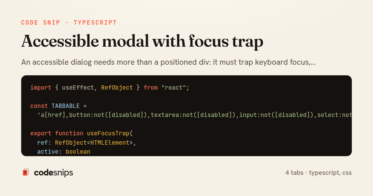
import { useEffect, RefObject } from "react";

const TABBABLE =
  'a[href],button:not([disabled]),textarea:not([disabled]),input:not([disabled]),select:not([disabled]),[tabindex]:not([tabindex="-1"])';

export function useFocusTrap(
  ref: RefObject<HTMLElement>,
  active: boolean
): void {
  useEffect(() => {
    if (!active || !ref.current) return;

    const container = ref.current;
    const previouslyFocused = document.activeElement as HTMLElement | null;

    const getTabbable = (): HTMLElement[] =>
      Array.from(container.querySelectorAll<HTMLElement>(TABBABLE)).filter(
        (el) => el.offsetParent !== null
      );

    const tabbable = getTabbable();
    (tabbable[0] ?? container).focus();

    const onKeyDown = (e: KeyboardEvent) => {
      if (e.key !== "Tab") return;
      const items = getTabbable();
      if (items.length === 0) return;

      const first = items[0];
      const last = items[items.length - 1];

      if (e.shiftKey && document.activeElement === first) {
        e.preventDefault();
        last.focus();
      } else if (!e.shiftKey && document.activeElement === last) {
        e.preventDefault();
        first.focus();
      }
    };

    container.addEventListener("keydown", onKeyDown);
    return () => {
      container.removeEventListener("keydown", onKeyDown);
      previouslyFocused?.focus();
    };
  }, [ref, active]);
}
import { useEffect } from "react";

export function useScrollLock(active: boolean): void {
  useEffect(() => {
    if (!active) return;

    const { body, documentElement } = document;
    const prevOverflow = body.style.overflow;
    const prevPaddingRight = body.style.paddingRight;

    const scrollbarWidth =
      window.innerWidth - documentElement.clientWidth;

    body.style.overflow = "hidden";
    if (scrollbarWidth > 0) {
      body.style.paddingRight = `${scrollbarWidth}px`;
    }

    return () => {
      body.style.overflow = prevOverflow;
      body.style.paddingRight = prevPaddingRight;
    };
  }, [active]);
}
import { useEffect, useRef, ReactNode } from "react";
import { createPortal } from "react-dom";
import { useFocusTrap } from "./useFocusTrap";
import { useScrollLock } from "./useScrollLock";

interface ModalProps {
  open: boolean;
  onClose: () => void;
  title: string;
  children: ReactNode;
}

export function Modal({ open, onClose, title, children }: ModalProps) {
  const panelRef = useRef<HTMLDivElement>(null);
  const titleId = useRef(`modal-${Math.random().toString(36).slice(2)}`).current;

  useFocusTrap(panelRef, open);
  useScrollLock(open);

  useEffect(() => {
    if (!open) return;
    const onKey = (e: KeyboardEvent) => {
      if (e.key === "Escape") onClose();
    };
    document.addEventListener("keydown", onKey);
    return () => document.removeEventListener("keydown", onKey);
  }, [open, onClose]);

  if (!open) return null;

  return createPortal(
    <div className="modal-backdrop" onMouseDown={onClose}>
      <div
        ref={panelRef}
        className="modal-panel"
        role="dialog"
        aria-modal="true"
        aria-labelledby={titleId}
        tabIndex={-1}
        onMouseDown={(e) => e.stopPropagation()}
      >
        <header className="modal-header">
          <h2 id={titleId}>{title}</h2>
          <button type="button" aria-label="Close" onClick={onClose}>
            ×
          </button>
        </header>
        <div className="modal-body">{children}</div>
      </div>
    </div>,
    document.body
  );
}
.modal-backdrop {
  position: fixed;
  inset: 0;
  background: rgba(15, 23, 42, 0.55);
  display: flex;
  align-items: center;
  justify-content: center;
  padding: 1rem;
  z-index: 1000;
}

.modal-panel {
  background: #fff;
  border-radius: 12px;
  max-width: 32rem;
  width: 100%;
  max-height: 90vh;
  overflow-y: auto;
  box-shadow: 0 20px 50px rgba(0, 0, 0, 0.25);
}

.modal-panel:focus {
  outline: none;
}

.modal-header {
  display: flex;
  align-items: center;
  justify-content: space-between;
  padding: 1rem 1.25rem;
  border-bottom: 1px solid #e2e8f0;
}

.modal-header button {
  font-size: 1.5rem;
  line-height: 1;
  background: none;
  border: none;
  cursor: pointer;
}

.modal-body {
  padding: 1.25rem;
}
An accessible dialog needs more than a positioned div: it must trap keyboard focus, restore focus when it closes, respond to the Escape key, and expose the right ARIA roles so screen readers announce it as a modal. This snippet splits that responsibility across a reusable focus-trap hook, a small scroll-lock hook, and the Modal component that wires them together.
useFocusTrap hook is the core of the pattern. When active it records document.activeElement so focus can be returned later, then queries the container for tabbable elements using a selector that excludes disabled controls and tabindex="-1". Initial focus moves to the first tabbable node so keyboard users start inside the dialog. The keydown handler intercepts Tab and Shift+Tab at the boundaries, wrapping from last to first and vice versa; this is what keeps focus from escaping to the page behind the overlay. On cleanup it calls previouslyFocused.focus(), which is why triggering a modal and closing it returns the user to the button that opened it.
useScrollLock hook addresses a subtler problem: without it, scrolling the page behind the overlay is still possible, and removing the scrollbar causes a layout shift. It measures the scrollbar width via innerWidth - documentElement.clientWidth and compensates with paddingRight while setting overflow: hidden, then restores the original inline styles on unmount. Capturing the previous values rather than hardcoding empty strings avoids clobbering styles set elsewhere.
Modal component composes the two hooks and adds the semantic layer. It renders through createPortal into document.body so the dialog is not constrained by parent overflow or z-index stacking contexts. The container carries role="dialog", aria-modal="true", and aria-labelledby pointing at the title, giving assistive technology the information it needs. Clicking the backdrop closes, but stopPropagation on the panel prevents inner clicks from bubbling up and dismissing it. Rendering null when open is false keeps the trap and lock hooks from running needlessly.
The main pitfall this design avoids is scattering focus logic inside the component body; keeping it in useFocusTrap makes it testable and reusable across dialogs, drawers, and popovers.
Related snips
export interface RetryOptions {
  retries: number;
  baseMs: number;
  maxMs: number;
  signal?: AbortSignal;
  onRetry?: (attempt: number, delay: number, err: unknown) => void;
Exponential backoff with jitter for retries
<!DOCTYPE html>
<html lang="en">
<head>
  <meta charset="UTF-8">
  <meta name="viewport" content="width=device-width, initial-scale=1.0">
  <title>Semantic HTML Example</title>
Semantic HTML5 elements and accessibility best practices
import axios, { AxiosError } from 'axios'
import { v4 as uuidv4 } from 'uuid'

const api = axios.create({
  baseURL: import.meta.env.VITE_API_URL || 'http://localhost:3000/api/v1',
  timeout: 15000,
Axios API client with interceptors
import { create } from 'zustand'
import { persist } from 'zustand/middleware'

interface FilterState {
  search: string
  category: string | null
Zustand for lightweight state management
<!DOCTYPE html>
<html lang="en">
<head>
  <meta charset="UTF-8">
  <title>Form Validation Example</title>
  <style>
HTML forms with validation and accessibility
import { Application } from "@hotwired/stimulus"
import FormSubmitController from "./controllers/form_submit_controller"

const application = Application.start()
application.debug = false
Disable submit button while Turbo form is submitting
Share this code
Here's the card — post it anywhere.