swift
83 lines · 1 tab
Sofia Martinez
Jan 2026
1 tab
import SwiftUI

struct Triangle: Shape {
    func path(in rect: CGRect) -> Path {
        var path = Path()
        path.move(to: CGPoint(x: rect.midX, y: rect.minY))
        path.addLine(to: CGPoint(x: rect.maxX, y: rect.maxY))
        path.addLine(to: CGPoint(x: rect.minX, y: rect.maxY))
        path.closeSubpath()
        return path
    }
}

struct RoundedCorner: Shape {
    var radius: CGFloat = .infinity
    var corners: UIRectCorner = .allCorners

    func path(in rect: CGRect) -> Path {
        let path = UIBezierPath(
            roundedRect: rect,
            byRoundingCorners: corners,
            cornerRadii: CGSize(width: radius, height: radius)
        )
        return Path(path.cgPath)
    }
}

struct Arc: Shape {
    var startAngle: Angle
    var endAngle: Angle
    var clockwise: Bool = false

    var animatableData: AnimatablePair<Double, Double> {
        get {
            AnimatablePair(startAngle.radians, endAngle.radians)
        }
        set {
            startAngle = Angle(radians: newValue.first)
            endAngle = Angle(radians: newValue.second)
        }
    }

    func path(in rect: CGRect) -> Path {
        var path = Path()
        path.addArc(
            center: CGPoint(x: rect.midX, y: rect.midY),
            radius: rect.width / 2,
            startAngle: startAngle,
            endAngle: endAngle,
            clockwise: !clockwise
        )
        return path
    }
}

struct ProgressRing: View {
    let progress: Double
    let lineWidth: CGFloat = 20

    var body: some View {
        ZStack {
            Circle()
                .stroke(Color.gray.opacity(0.3), lineWidth: lineWidth)

            Arc(
                startAngle: .degrees(-90),
                endAngle: .degrees(-90 + 360 * progress)
            )
            .stroke(
                AngularGradient(
                    colors: [.blue, .purple, .pink],
                    center: .center
                ),
                style: StrokeStyle(lineWidth: lineWidth, lineCap: .round)
            )

            Text("\(Int(progress * 100))%")
                .font(.largeTitle)
                .fontWeight(.bold)
        }
        .frame(width: 200, height: 200)
    }
}
1 file · swift
Explain with highlit
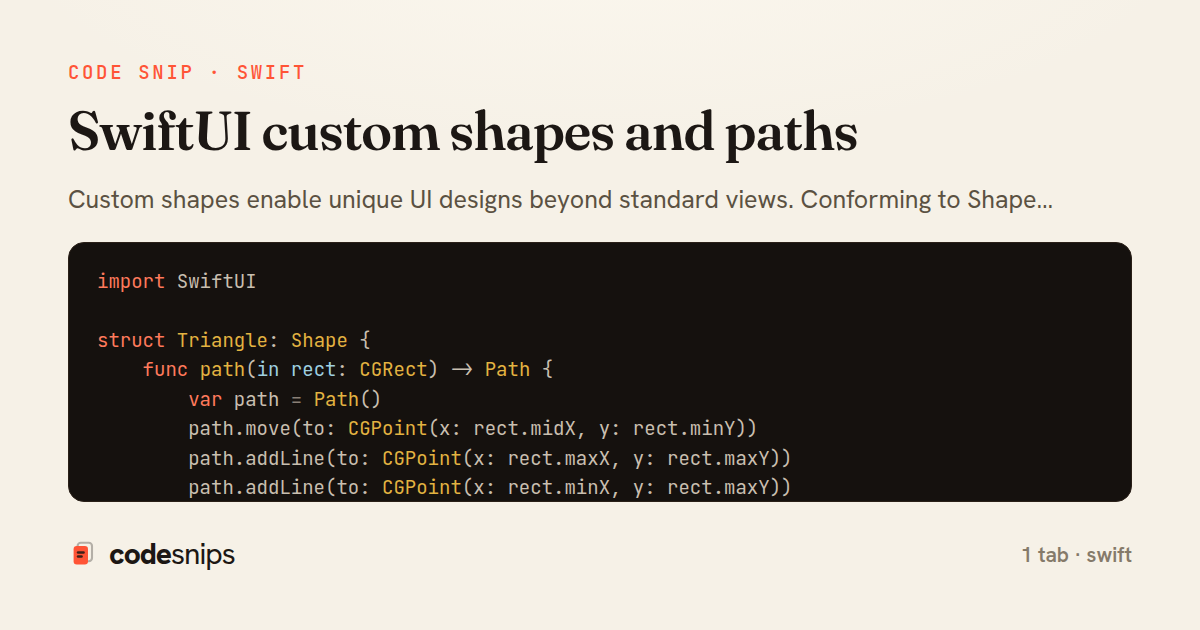
Custom shapes enable unique UI designs beyond standard views. Conforming to Shape protocol requires implementing path(in:) that returns a Path describing the geometry. I use path methods like move(to:), addLine(to:), addArc(), and addCurve() to draw complex shapes. Shapes work with modifiers like fill(), stroke(), and trim(). For animations, shapes can have animatable properties by conforming to Animatable. Common use cases include progress indicators, custom buttons, charts, and decorative elements. Combining shapes with GeometryReader creates responsive designs. Reusable shapes improve code organization and enable consistent design systems.
Related snips
swift
import Combine
import Foundation

class SearchViewModel: ObservableObject {
    @Published var searchQuery = ""
    @Published var results: [SearchResult] = []
Combine operators for data transformation
swift
combine
reactive
by Sofia Martinez
1 tab
swift
import SwiftUI

struct ContentView: View {
    @State private var username = ""
    @State private var isLoggedIn = false
    @StateObject private var viewModel = LoginViewModel()
SwiftUI declarative UI with state management
swift
swiftui
ios
by Sofia Martinez
2 tabs
javascript
// Get canvas and context
const canvas = document.getElementById('myCanvas');
const ctx = canvas.getContext('2d');

// 1. Basic shapes
// Rectangle (filled)
Canvas API for graphics and animations
canvas
javascript
graphics
by Alex Chang
1 tab
swift
import SwiftUI

struct CardModifier: ViewModifier {
    var backgroundColor: Color = .white
    var cornerRadius: CGFloat = 12
    var shadowRadius: CGFloat = 5
Custom SwiftUI view modifiers for reusability
swift
swiftui
ios
by Sofia Martinez
2 tabs
swift
import Foundation
import UIKit

class ImageProcessor {
    // Background processing with main thread updates
    func processImage(_ image: UIImage, completion: @escaping (UIImage?) -> Void) {
Grand Central Dispatch for concurrency
swift
gcd
concurrency
by Sofia Martinez
1 tab
swift
import SwiftUI

enum Route: Hashable {
    case postDetail(id: Int)
    case userProfile(id: Int)
    case settings
Navigation patterns with NavigationStack
swift
swiftui
navigation
by Sofia Martinez
2 tabs
Share this code
Here's the card — post it anywhere.