python
20 lines · 1 tab
Dr. Elena Vasquez
Apr 2026
1 tab
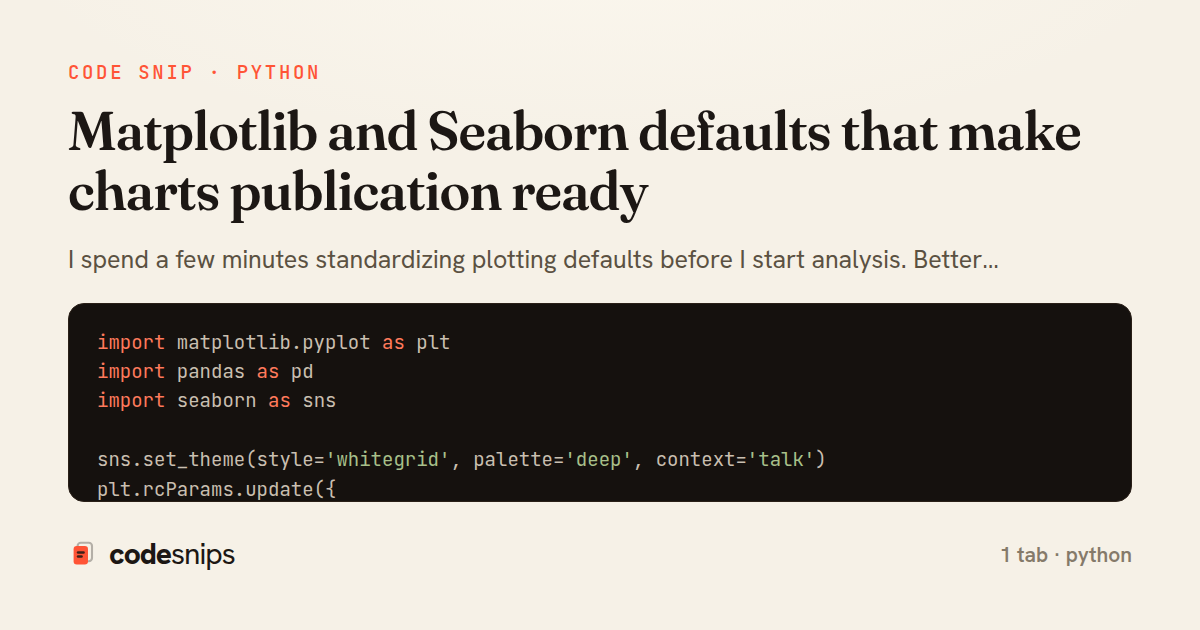
import matplotlib.pyplot as plt
import pandas as pd
import seaborn as sns

sns.set_theme(style='whitegrid', palette='deep', context='talk')
plt.rcParams.update({
    'figure.figsize': (12, 6),
    'axes.titlesize': 18,
    'axes.labelsize': 14,
    'legend.frameon': False,
})

df = pd.read_csv('revenue_by_month.csv')
ax = sns.lineplot(data=df, x='month', y='revenue', hue='region', marker='o')
ax.set_title('Monthly revenue by region')
ax.set_xlabel('Month')
ax.set_ylabel('Revenue (USD)')
plt.xticks(rotation=45)
plt.tight_layout()
plt.show()
1 file · python
Explain with highlit
I spend a few minutes standardizing plotting defaults before I start analysis. Better typography, clear labels, and consistent palette choices reduce review cycles and improve notebook readability. Charts should explain themselves without requiring a voiceover in a meeting.
Share this code
Here's the card — post it anywhere.