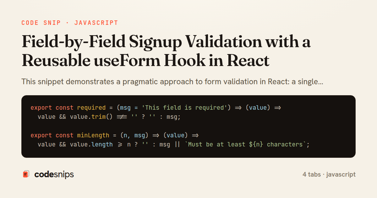
export const required = (msg = 'This field is required') => (value) =>
  value && value.trim() !== '' ? '' : msg;

export const minLength = (n, msg) => (value) =>
  value && value.length >= n ? '' : msg || `Must be at least ${n} characters`;

export const isEmail = (msg = 'Enter a valid email address') => (value) =>
  /^[^\s@]+@[^\s@]+\.[^\s@]+$/.test(value || '') ? '' : msg;

export const matches = (getOther, msg = 'Values do not match') => (value, values) =>
  value === getOther(values) ? '' : msg;

export const compose = (...rules) => (value, values) => {
  for (const rule of rules) {
    const error = rule(value, values);
    if (error) return error;
  }
  return '';
};
import { useCallback, useMemo, useState } from 'react';

export function useForm({ initialValues, validators }) {
  const [values, setValues] = useState(initialValues);
  const [touched, setTouched] = useState({});

  const runValidators = useCallback(
    (vals) => {
      const result = {};
      for (const name of Object.keys(validators)) {
        result[name] = validators[name](vals[name], vals);
      }
      return result;
    },
    [validators]
  );

  const errors = useMemo(() => runValidators(values), [values, runValidators]);
  const isValid = useMemo(() => Object.values(errors).every((e) => !e), [errors]);

  const handleChange = useCallback((event) => {
    const { name, value } = event.target;
    setValues((prev) => ({ ...prev, [name]: value }));
  }, []);

  const handleBlur = useCallback((event) => {
    const { name } = event.target;
    setTouched((prev) => ({ ...prev, [name]: true }));
  }, []);

  const getFieldProps = useCallback(
    (name) => ({
      name,
      value: values[name] ?? '',
      onChange: handleChange,
      onBlur: handleBlur,
      'aria-invalid': touched[name] && !!errors[name],
      'aria-describedby': `${name}-error`,
    }),
    [values, touched, errors, handleChange, handleBlur]
  );

  const handleSubmit = useCallback(
    (onValid) => (event) => {
      event.preventDefault();
      const allTouched = Object.keys(validators).reduce(
        (acc, name) => ({ ...acc, [name]: true }),
        {}
      );
      setTouched(allTouched);
      if (Object.values(runValidators(values)).every((e) => !e)) {
        onValid(values);
      }
    },
    [values, validators, runValidators]
  );

  return { values, errors, touched, isValid, getFieldProps, handleSubmit };
}
export function FieldError({ name, error, touched }) {
  const visible = touched && !!error;
  return (
    <span
      id={`${name}-error`}
      role="alert"
      className={visible ? 'field-error field-error--visible' : 'field-error'}
    >
      {visible ? error : ''}
    </span>
  );
}
import { useForm } from './useForm';
import { FieldError } from './FieldError';
import { required, minLength, isEmail, matches, compose } from './validators';

const validators = {
  email: compose(required(), isEmail()),
  password: compose(required(), minLength(8)),
  confirm: compose(
    required('Please confirm your password'),
    matches((v) => v.password, 'Passwords must match')
  ),
};

export default function SignupForm({ onRegister }) {
  const { errors, touched, isValid, getFieldProps, handleSubmit } = useForm({
    initialValues: { email: '', password: '', confirm: '' },
    validators,
  });

  return (
    <form noValidate onSubmit={handleSubmit(onRegister)}>
      <label htmlFor="email">Email</label>
      <input id="email" type="email" autoComplete="email" {...getFieldProps('email')} />
      <FieldError name="email" error={errors.email} touched={touched.email} />

      <label htmlFor="password">Password</label>
      <input id="password" type="password" autoComplete="new-password" {...getFieldProps('password')} />
      <FieldError name="password" error={errors.password} touched={touched.password} />

      <label htmlFor="confirm">Confirm password</label>
      <input id="confirm" type="password" autoComplete="new-password" {...getFieldProps('confirm')} />
      <FieldError name="confirm" error={errors.confirm} touched={touched.confirm} />

      <button type="submit" disabled={!isValid}>
        Create account
      </button>
    </form>
  );
}
This snippet demonstrates a pragmatic approach to form validation in React: a single reusable useForm hook that owns field values, tracks which fields have been touched, and runs a declarative validation schema per field. The goal is to validate as the user progresses — showing an error only after a field is blurred — rather than blasting every error on first render or waiting until submit.
In useForm hook, state is split into three maps: values, touched, and derived errors. The validators argument is a plain object mapping each field name to a function returning an error string or an empty value. runValidators is memoized with useCallback so it can safely feed a useMemo that recomputes errors only when values or validators change; this keeps validation cheap and pure. handleChange updates the value, while handleBlur flips the touched flag so the UI can reveal an error at the right moment. handleSubmit marks every field touched and blocks the callback when any validator still fails, covering the case where a user hits submit without ever touching a field.
validators.js holds the actual rules as small composable predicates — required, minLength, isEmail, and a compose helper that returns the first failing message. Keeping rules outside the component makes them unit-testable and shareable across forms, and compose short-circuits so the most relevant message wins.
FieldError component is a tiny presentational component that renders nothing unless the field is both touched and invalid. It wires role="alert" and an id so the input can reference it via aria-describedby, which matters for screen-reader users who otherwise never hear inline errors.
SignupForm component ties it together: it spreads getFieldProps onto each input to bind value, onChange, and onBlur in one call, sets aria-invalid, and disables submit while the form is invalid. The trade-off of this hook-based approach is that it re-renders on every keystroke, which is fine for small forms but would warrant a library like React Hook Form for very large or deeply nested ones. For a signup screen, though, this keeps the logic transparent, dependency-free, and easy to extend with new fields or rules.
Related snips
<!DOCTYPE html>
<html lang="en">
<head>
  <meta charset="UTF-8">
  <meta name="viewport" content="width=device-width, initial-scale=1.0">
  <title>Semantic HTML Example</title>
Semantic HTML5 elements and accessibility best practices
class SignupForm
  include ActiveModel::Model
  include ActiveModel::Attributes

  attribute :account_name, :string
  attribute :email, :string
Shallow Controller, Deep Params: Form Object Pattern
import { Controller } from "@hotwired/stimulus"
import Mousetrap from "mousetrap"

export default class extends Controller {
  connect() {
    // Global shortcuts
Keyboard shortcuts with Stimulus and Mousetrap
import axios, { AxiosError } from 'axios'
import { v4 as uuidv4 } from 'uuid'

const api = axios.create({
  baseURL: import.meta.env.VITE_API_URL || 'http://localhost:3000/api/v1',
  timeout: 15000,
Axios API client with interceptors
import { create } from 'zustand'
import { persist } from 'zustand/middleware'

interface FilterState {
  search: string
  category: string | null
Zustand for lightweight state management
import SwiftUI

struct ContentView: View {
    @State private var username = ""
    @State private var isLoggedIn = false
    @StateObject private var viewModel = LoginViewModel()
SwiftUI declarative UI with state management
Share this code
Here's the card — post it anywhere.